Sunday, February 27, 2011

February Finale! The wedding of Reed & Sue!

 28 days! 28 covers! Wow! Never thought I'd actually get to this point--but here it is and I just made it--just barely, that is! Up till the last minute I was coloring away with my prismacolors, oblivious to just about everything else going on in the house (or the world)--snow, rain, ice-for me, the weekend was all about "imperial violet" or "parma violet"? "rose pink" or "process red"? What? You said there's a glacier on the roof about to cause a cave in? I'll get to it in a minute, dear-- after I finish coloring in Dr. Doom.
So--- how to wind up my month-long blog-a-thon ? I wanted something special to mark the occasion--and well, what's better than a wedding? And what wedding--in all of history--in all the known and unknown galaxies-- could compare to that of Reed and Sue?
We all know the answer to that one true believers!
And what a cover it is! Practically every known super-goodie or super-baddie in the Marvel universe circa 1965 shows up for the happy couple's big day! Kirby went to town on this sucker and delivered the goods baby! It's just a damn shame Stan Lee put Jack's interior pages in the hands of Vince Colletta.  It looks like Colletta used just one tiny size rapidograph for the entire issue.  Practically ruins the entire event. But not that cover, boy! No sirree! I'm guessing Joe Sinnott inked the cover for FF King Size #3!--and the difference shows.

 Drawing this one was a much about mapping as drawing, really. Talk about an exercise in frustration! Because the proportions between my sketchbook and the original comic are different--there's a good deal of futzing that goes on in the attempt to replicate that space and all those characters.
The attraction of the original is in part owing to the color choice--the simplicity of the white ground against the myriad of colored do-gooders and do-baddies, coupled with the deep purple and bright red logo, makes for a compelling package. I thought it'd be silly to recreate that color-it'd just be filling in the figures, really. So, why not go somewhere else with it? And so I made the ground more active--and simplified the figures. Defeats the purpose, really--given that the guest stars are the selling point--and you want to emphasize them--not suppress them. But--I'm not selling anything, so what the hell?
Anyway-while we've reached the conclusion of this project, the endeavor goes on--so I'll be back with something new soon. What might that be, exactly? I have no idea. There are a lot of comic book covers out there--and a bunch of my own I didn't get to--so maybe I'll be back with one or two every now and again. Or maybe something entirely different. Check back and see!

culture shock: MAD


I'm ten years too young for the original Mad, but these comics were still around, in one form or another, throughout my childhood in the 1960's. I think my first exposure to the original Mad was via those great paperback collections somebody's older brother had. They got passed around the neighborhood
--the way most comics did in those days. Somebody had a comic book, it was community property. Passing comics around was a way in which we educated each other--and developed a shared sensibility. We didn't want to keep them to ourselves.
Matter of fact, I think my first exposure to a lot of Mad--and other comics too; Peanuts, B.C., Fantastic Four and a lot of other Marvel stuff- was in those b&w paperback collections floating around the neighborhood.   I know for a fact that's where I first learned who Jack Kirby was--and then who Chic Stone was.(I could've cared less about Stan Lee.--but Chic Stone was tops!)
 Even in the '60's, when Mad magazine was in its heyday, -and my friends and I sat on each others stoops going over every single gag in every single issue--these original Mads were special. They seemed like relics from a different, somehow more subversive, era--a little less predictable than the Mad we knew; wilder, not quite as formulaic.  They had super-heroes! "Super-duper Man" and "Melvin of the Apes". And the art was just great, stuffed to the brim with little jokes and funny goings-on in the background. We'd look at them for hours because we kept finding some new joke in there that we hadn't seen before. Astounding images--drawn by some guy named "Wood"--and boy did he draw great looking women("Lois -Hah!-Pain!") and great shadows and great everything! And man--they were so funny, funnier than Mad magazine, funnier than anything we knew. A kind of manic funny--wise-ass in a way the magazine of the '60's was not. Reading those original Mads, you got the feeling the people behind those comics had spent a lot of time in after-school detention, they shot spit-wads in Sunday school and had absolutely no use for authority figures, and as adults they were probably just this far from giving some bureaucrat at the DMV a hotfoot.

*This one was a good deal trickier to draw than it looks!

Saturday, February 26, 2011

The Future Past: Adam Strange and Carmine Infantino

I loved what Paul Pope did for Adam Strange in the pages
of Wednesday Comics a couple of summers ago. Interestingly enough though, Pope's "Strange" was more like the best Flash Gordon strip in years, rather than a traditional Adam Strange story. For me, Adam Strange is locked into a specific era, the late fifties-early sixties, the Friendship 7-Mercury rocket era U.S.-- and a specific look--the clean, idealistic work of Carmine Infantino and Murphy Anderson. Infantino's visualizations reek of the idealized urban future, and looking at his work from this period on "Strange" or for that matter, "The Flash", you feel as though you have a telescope into the mind's eye of a culture, and hold their imagined future in your hands.  As such, there's an embedded sense of nostalgia--and loss- in Infantino's work, loss of a particularly domesticated view of tomorrow, and with it, the loss of a sense of possibility.
This looks like an Infantino cover to me, although I'm not at all sure--and were I to guess, I'd say Joe Giella inks rather than the usual Murphy Anderson( although Anderson drew the heads framing the blurb.)

Friday, February 25, 2011

Friday Frankenstein: MoF no.1


Afraid I'm something of a traditionalist when it comes to Frankie--a Universal Studios'
Frankenstein-style traditionalist, that is. I've read the Shelley, of course--and seen the various versions, from the Branagh to the Hammer--but it's the monster of Boris Karloff and James Whale that haunts my memory. So, back in '72, while I was thrilled to have Marvel's Monster of Frankenstein , I was also a little disappointed it wasn't the image of Karloff on the cover of MoF no.1, that the scene wasn't in a gothic castle and Frankie was gray, not green! (Where did that green come from, anyway? The movies were b & W! Ah, yes--the green came from the original movie posters!)
Well-Marvel had The Hulk, of course, and probably didn't want to confuse readers with another green-skinned monster, --and there'd probably be some copyright issue with Universal if the monster on MoF no.1 was chartreuse--so, gray monster. Still, I would've made him purple--or something.
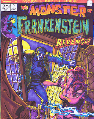
So--I tweaked Mike Ploog's manic cover a bit--(isn't it wonderfully manic? -the compressed space gives it a bit of that chaotic feeling of '40's Timely covers), moved the scene from the laboratory to the castle, and ---colored the big guy green! (have I been doing that all along?--I think I have, upon reflection.)
 So, for my last Frankenstein of February, here's Mike Ploog's Monster of Frankenstein no.1, with a little Karloff/Whale for good measure!

Thursday, February 24, 2011

Absolutely Final Starlin*: Mar-Vell no.33

(* well, for this month, anyway. )Once again--this is from the very beginnings of this project, before I knew I was doing anything, and I drew this quickly one morning at work before the day began-so it's really loose. It was fun to do. Coloring came later--and this was the first page I colored, so I was merely trying to replicate at this point. Rather than use black for the night sky, I layered ultramarine over a red-making for a richer night sky and saving my black markers! Drawing Thanos in action was the attraction--for my money, (all 25 cents of it in 1973) this is one of Starlin's best depictions of him.  What a great image! What a malevolent creature!

Wednesday, February 23, 2011

Swamp Thing no.10


Couldn't just do one Wrightson cover--had to do another, and here 'tis: Swamp Thing no.10.

Tuesday, February 22, 2011

Swamp Thing no.9: Berni Wrightson


 Before Alan Moore, before Steve Bissette, there was Len Wein and Berni Wrightson.   While Moore and Bissette discovered depths to the character no one previously imagined, no matter how old I become, when I think of the character, Berni Wrightson's cover for Swamp Thing no.9 will be the image that comes to mind.
I worried about this piece a good deal before coloring it. How do you improve on something so beautifully attuned to the mood of the image as the coloring for Wrightson's magnificent drawing? The answer--you don't. So---I had two choices--copy it as closely as possible--or do something entirely different. I decided for the latter, and here's the result. Hope you enjoy it.

Monday, February 21, 2011

Laugh out Loud: Dennis by Al Wiseman


As a kid,  Dennis the Menace was one of my absolute favorite comic books--and I loved it far more than the TV show or the daily newspaper panel, although I loved that too. But the comics accomplished something very few funny comics(other then Mad) actually did-they made me howl with laughter. Dennis was a holy terror-fully deserving of the title, and in the comic books, the storytellers( Fred Toole,writer and Al Wiseman, artist) had the opportunity to fully flesh out his irresistible destructiveness. Dennis could take a simple night out in a Chinese restaurant and turn it into a full-fledged disaster movie--his frustrated parents unable to do anything but stand back and watch in amazement as their little whirlwind wreaked havoc upon an unwitting society. I loved every beautifully wrought, fine line of it!
And the art was indeed something to marvel at. Modeled upon Hank Ketcham's exquisite designs, Al Wiseman had a style all his own; clean, crisp, sharp, minimal but wonderfully expressive. You never saw lawns so neatly manicured, suits so crisply tailored, towns so ordered and picturesque --a picture-perfect suburbia circa 1960, just made for a tiny little tornado to pummel to the earth and leave in rubble. Order reduced to chaos in a matter of seconds at the hands of a three year old boy!
Do yourself a favor--search out some of these wonderful comics(that somebody, somewhere really ought to reprint!)sit back, and have a laugh!
& check out this link for more info on: Dennis --in the comic books.


* This one is for my mom, my first set of inks and crowquill pen(from "Colliers"house paint store in Binghamton--the only paint(& art supply) store in town) and the Dennis the Menace cartoon I drew with them(with only a few ink splots) that she framed and hung proudly on the wall! thanks, mom!

Sunday, February 20, 2011

Sunday Movie Matinee: Jerry Lewis


Jerry Lewis comic books? What the $#*%!? Who's idea was this? I have no idea what the equivalent comic would be today-Jimmy Fallon comics? Will Ferrell? Somehow-the idea was more appealing than the comics--and well, that's not saying much.
Will Ferrell comics? ( some comics publisher somewhere is rushing off to license that property, I'm just sure of it!)
But still, it held on for nearly 20 years! From 1952-1971, DC published a comic book starring Jerry Lewis, first as "The Adventures of Dean Martin and Jerry Lewis" and then, after the comedy team broke up in the mid- fifties, known simply as "The Adventures of Jerry Lewis".
The comics could be amusing-but never quite  LOL funny as they should have been.  But--JL did have the good fortune to be drawn by the late, great Bob Oksner, whom I believe drew this cover-and had a capacity for caricature and a talent for drawing rather fetching women, as you can see in this example. Over the course of his long but reatively unsung career, Oksner drew many a romance comic, a whole lot of Bob Hope, Shazam!, Supergirl and any book that needed attractive women and recognizable celebrities. He had a rich line, and a spare, clean style that never felt restrained or minimal-sort of like a cross between C.C. Beck, Curt Swan and Dick Giordano. Coming across his work in a comic was a treat, because you knew you were in for an attractive, consistent package, if not an innovative one.
 I enjoyed these comics in their day, mostly for their out and out silliness.  They are a reminder of a period when celebrities were somehow simpler cultural constructions and mainstream comic books on the spinner racks at the drugstore included humor and an array of genres amidst the super-heroes.

Saturday, February 19, 2011

Saturday Starlin!


It's Saturday Starlin time! When all is said and done, Starlin covers will make up more of these recreations than those by any other artist.
Not a conscious decision. In the beginning of the marathon, I was just rifling through my collection and pulling out any book that I had a fondness for and that had a cover that looked like it might be fun to draw. That I picked up a bunch of Starlin books is  an indication of just how much his seventies work meant to my teenage self and how large those books loom in my adult consciousness.
Starlin's been a challenge, largely because I don't draw at all like Starlin, his figures are really idiosyncratic, with extreme postures and musculature that I would never conceive of on my own. Michelangelo, Burne Hogarth, Steve Ditko, Aubrey Beardsley, Jack Kirby--they're all in the mix of Starlin's genius, making for some of the most eccentric yet dynamic inter-galactic super-hero space opera ever. I'd never thought of Starlin as an action guy so much, until I copied his drawings.
I didn't change a lot on this drawing--Warlock is a little bit more upright in my version, and I modified the color a bit here and there, making the piece less about gray against green, and more about a green/purple/pink contrast. Those little changes probably seem like nothing to a casual observer, but I spent hours(?) agonizing over what color to use in the circle indica on the upper lefthand corner. In the end, green was the perfect choice for the cover's  background color, and although I spent a good deal of time  playing around with alternatives, I never found anything that worked as well. (But you'll notice I moved away from a yellow-green toward a bluer green.)


Friday, February 18, 2011

Friday Frankenstein!


So..I admit it. I've done a lot of Ploog!(How many times do you hear that in rehab?) There will be at least one more of these, so I hope you like Mike Ploog--and Monster of Frankenstein as much as I do.
 And of all the Ploogs I've done, this and the one that kicked off this month-long blogging bonanza, were my favorites to do. This one in particular because of the drama of the sea, the boat in flames, and that elliptical space of Ploog's that I mentioned in the last one. That space is really apparent in this image--and it works wonderfully with the rollicking, burning boat being tossed upon the ocean waves.
Oh-and the beautiful girl tied to the mast didn't hurt.

Thursday, February 17, 2011

The Shadow no.3, my Kaluta no.2

The Shadow no.3-Another great Kaluta cover from the early seventies. This one looks like it's pen and ink in the foreground and watercolor with an ink wash in the background--but hell if I know.  Mine's all markers.  Anyway-great ominous atmosphere in that original! Thanks, Mike!

Wednesday, February 16, 2011

Our Love Story: John Romita


 Everybody knows the Spiderman of Lee and Romita was essentially a love story. (as distinguished from the Spiderman of Lee and Ditko) Maybe it still is, I don't know I haven't read it in 30 years. Nevertheless--the girl on the cover of Our Love Story no.1 is a classic Romita beauty-so why shouldn't she be Mary Jane Watson?

Tuesday, February 15, 2011

Young Romance


  Romance is in the air! And in honor of Valentine's day, I'm offering three covers from classic Romance Comics, yesterday's valentine- Confessions of Love,  today's Young Romance, and then tomorrow, Our Love Story .
Afraid there's not much I can tell you about these covers. If I were to take a guess, I'd say this might be a John Romita( tomorrow's definitely is), but there's something about the face of the disappointed young lady in the foreground that suggests in might be Frank Giacoia.  I don't have any idea who drew "Confessions of Love"-suffice to say that I like that one for its passion, but also for the fact that the woman is far from passive in that kiss.
I've included the b& w drawings. I color the originals directly in the sketchbook, so it's nice to have a record of how they looked before I went to town with the prismacolors!


Monday, February 14, 2011

Confessions of Love: A Valentine


 To my wife; you are the fire that warms my life, the nourishment that fills my soul, the center of my world. You are all that I hold dear.You have made our home a place of such contentment, such abiding warmth, that I never want to leave, and when finally I must, I think only of the minutes until I can be back with you.  I'd travel thousands of miles for just the promise of your smile. You are my partner, my best friend, my joy, my love.  I love you deeply, more deeply than I could imagine possible when I was young-my heart feels like a wide open sky, a rolling, endless landscape when I'm with you.
I can only hope that I can bring you the same warmth, joy and contentment that I feel. I will do my best to make it so, for to disappoint you would be the sorrow of my life.
For all of these years, for now and forever more- I love you.


Sunday, February 13, 2011

Strange Tales Indeed


Strange Tales no. 181-Starlin's Ditko homage! "1000 Clowns" is Starlin at his most completely wacked. There's the clowns, of course, Gamora(wow!) and Pip the Troll, but if that's not enough there's pie throwing--and it sure looks like Roy Thomas getting the pie in the face--and Warlock in full clown drag, including the red rubber nose, which was a really good look for him, believe it or not. At the end of this ish, having faced the Madness Monster within himself, Adam Warlock admits to being insane, which is always a good finish for a superhero comic. All in all, a classic, and as I look back on it, a formative influence on me. (Just check out my book "fandancer" to see what I'm talking about.)

For such a cosmic guy, Starlin loved to draw earthy, taught bodies with lots of rippling musculature.  You'd imagine something more ethereal for cosmic space opera, but Starlin's stylizations were and are perfect for these explorations of outer and inner space--they somehow endow these cosmic psycho-dramas with the necessary weight and terra-firma, so that they seem tangible, when it'd be all too easy for them to float off like the fluff of dreams.
Strange Tales no.181 is another of JS's fallen figure compositions, and the first Warlock cover I drew for this little project. I drew it quickly-- basically, I just wanted to see if I could draw Warlock upside down--and colored it just as quickly. Another of the Uniroyal ball point pen drawings--that pen encouraged a real loose, gestural approach. It was never meant to be more than a sketch, a momentary diversion while waiting for ol' Saint Nick and watching the snowfall. (Saint Nick has come and gone, but that snow doesn't know when to stop!)

Saturday, February 12, 2011

Jimmy Olsen no.115 by Neal Adams

This is one of those covers, like so many Neal Adams did for DC in the late sixties, that far surpasses the contents of the package. The story inside has none of the drama this image promises, nor anything approximating the bold flavor of Neal Adams' artwork. Still, the cover alone is well worth the 12 cents.  It's one of my favorites from Neal Adams' sixties work, primarily, I think because of the rich coloring, which he may or may not have had anything to do with. The image itself, simple,clean and spare, allows for the bold color to do its thing--and it was indeed, a seductive object-commanding my attention amidst all the competition on the spinner rack back in 1968.
In many ways, it encapsulates that which attracts me to comics, to art-to this day--the joyous flat color, the simplicity of its spare but powerful arrangement of forms and figures. It speaks to the power of color in comics-and color rarely gets its due, it seems to me, when talking about comics art. Perhaps that originates in the secondary role colorists were given in the assembly line production of comic books, but it belies the primacy of color in art.
Nevertheless, Adams' fluid line, his inky blacks, dynamic figures and boundless space, --all attest to his craft and imagination-and suggest that Superman, Aquaman, and Jimmy Olsen live on in a world much closer to us than we ever thought possible.

*I was using the Uniroyal ball point pen and I think this was the first of these I decided to color. And the first Neal Adams piece I'd copied since I was about 14. It was a challenge then--&  it still is!

Friday, February 11, 2011

The Ultimate Comic; Warlock


Warlock was the comic for me when I was 14-15. In Jim Starlin's hands it was a masterpiece of cosmic space-opera, replete with cigar-smoking trolls, beautiful women (more likely to kill you than kiss you) and galactic revolution against an evil empire(before Star Wars!), all topped off with a mystic quest to come to terms with identity, fate and the meaning of existence! And all of it masterfully orchestrated in the hands of the most interesting and innovative comics creator of his generation. Wow. Can't top that! And for a period of about a year and a half--Warlock was the best book on the comics racks.
The fallen figure positioned at the bottom of the page was a favorite motif of Starlin's during these years--he uses it at least two or three times during his Warlock run, and at least once on Captain Marvel; nevertheless, it's always effective. And it contributes to a sense of monumentality(-those fallen heroes seem enormous-)-appropriate to the stories he was telling.

I chose to play around with the color scheme on this one. I'm a sucker for that blue in the sky that dominates the original--but I wanted to try a warmer palette--and see its impact on the emotional character of the piece. apologies for the wonky logo!


Thursday, February 10, 2011

Klik-Klak,Kamandi & Kirby

This was the first issue I bought of Kamandi back in '73. I'd held off in part because it wasn't a traditional super-hero book, (no colorful costumes!) and because it had been abruptly inserted into the DC lineup in place of the New Gods( or was it The Forever People?)
 I found this cover irresistible--still do. The image of an enormous insect on a leash, leaping from the page, was too exciting, too intriguing to ignore, and so I plunked down my 20 cents and walked out of the drugstore with Kamandi no.12.

Suffice to say, I was hooked right away and bought every issue thereafter until Jack left the series.  And while Kamandi's origins lie in DC publisher Carmine Infantino's hope to capitalize on the "Planet of the Apes" craze, Jack made it his own, so much so that from a contemporary vantage point, I think Kamandi holds up much better than the "Apes" movies themselves--or at least the sequels. And while it's often dismissed as an "Apes" rip-off,  Kamandi is filled with imaginative characters that by all rights should have found their way into those movies. Characters such as Klik-Klak, the giant grasshopper who adorns this cover and its follow-up, and who was as good a friend as Kamandi ever came across and who was lost to Kamandi, and to us, all too soon. Despite only a few appearances, Klik Klak made a strong enough impression that he's remembered fondly 40 years after the fact.  Jack could do that, create incidental characters that were unforgettable.

Wednesday, February 9, 2011

Ploog in Space: MoF no.3


 More Ploog! As I mentioned in the first post, I wanted to do a number of these Ploog covers from his early run on "The Monster of Frankenstein"--before Marvel changed the logo. If I were to take a guess, I'd say this logo was an invention of Mike Ploog himself--so well attuned to his sensibility it seems to be. I loved drawing this logo, it really has that movie monster vibe.
I've talked a little about pictorial space, in Kirby and Kane. In some of these early covers, Ploog defines a space all his own-very different from either K & K -and a unique response to the division between upper and lower tiers seen in early seventies Marvel covers. In this piece and in a few others, there's an almost elliptical sense of space. His figures seem to be scooped up within a curvilinear embrace that holds them within the boundaries of the page, but allows for breathing room in and around them.  Not only does Ploog subvert the editorial restriction, but he uses this innovation to expressive effect as well, the elliptical space imbuing a sense of volatility and unease appropriate to his subject.


Tuesday, February 8, 2011

Gil Kane: The Atom, no.32

As a little guy I get a kick out of the Atom as a colossus. Great cover by Gil Kane in period when he did a lot of great covers for DC, on the Atom and Green Lantern in particular. The covers he did for DC are very different in their use of pictorial space from those he did for Marvel in the Seventies. The Marvel covers are -for the most part--divided between upper and lower tiers, compressing the area in which Kane placed his figures. In contrast, the DC covers from the sixties allow for more vertical freedom, and so we see a good deal more flexibility and freedom in Kane's compositions. I'm guessing this was an editorial directive, because a good many Marvel covers of the seventies are composed accordingly, the artists might have been told that the action takes place within such and such an area below the logo. At the point in the sixties when "The Atom" cover was done, there doesn't seem to have been such a directive at DC, and so their covers, by Kane, Infantino, Kubert and especially Adams-are unique in the freedom with which they play around with space.  So this is one of Kane's best, I think--and it's wonderful for the way he pulls the viewer up and into the space, making the 6" x 9" picture area seem vast and The Atom himself as monumental as--oh--Mount Rushmore.

Monday, February 7, 2011

If Burne Hogarth is the Mickey L of Comics, then Frazetta is...?

Rubens' love of women. Goya's sense of the macabre. But without Rubens' sense of hedonistic joy, or Goya's taste for satire. mix in that uniquely American love of pulp-y trash.
Frazetta. Need I say more? For the conclusion of my first week I thought I'd put up something special--& this cover is one of my absolute faves. Working on these covers you learn some things about the techniques & approaches of the masters that you don't get simply by looking. For instance,  while sketching out this scenario, I definitely picked up the vibe that Frazetta was making this one up as he went along; very little -if any--preliminary drawing.  The Iron bar tracery on the gates is irregular--way too irregular for just a ruin. & The architecture in general is pretty vague. But the big clue is that, well--the Werewolf... in his attempt to conquer the Count--is sitting on Dracula. Who arranges a fight scene like that? Somebody who can make it all up directly from their imagination, that's who. It's not likely you'd hire models to hold this pose for any length of time!
Of course, prismacolor markers aren't oil paint, and so I had to make some alterations to Frazetta's color. I was quite happy to do so-what artist in their right mind wants to be compared with the maestro?